“For the rays, to speak properly, are not coloured.”
— Isaac Newton, Opticks (1704)
As Newton taught us, white light carries all colors; what we see depends on the surface it touches. If white contains everything, it would seem that artists should be able to mix it. But of course, we can’t. As a watercolorist—my primary medium—I learned this early on: white isn’t made, it’s preserved.
White is often described as pure, quiet, empty, or neutral. Across cultures, it carries symbolic weight—innocence, cleanliness, clarity, mourning, beginnings, erasure. Emotionally, white can feel calm and spacious, but it can also feel stark, even severe.
These meanings matter, but they are not fixed, and they are not inherent to the materials themselves.
This study sets symbolism aside to ask a simpler question: what does white do—physically—when it is built through layers, fibers, and surfaces?
Beneath this inquiry is a curiosity about attention—what happens when pigment thins, when thread interrupts, when a surface asks the eye to keep working rather than to settle.
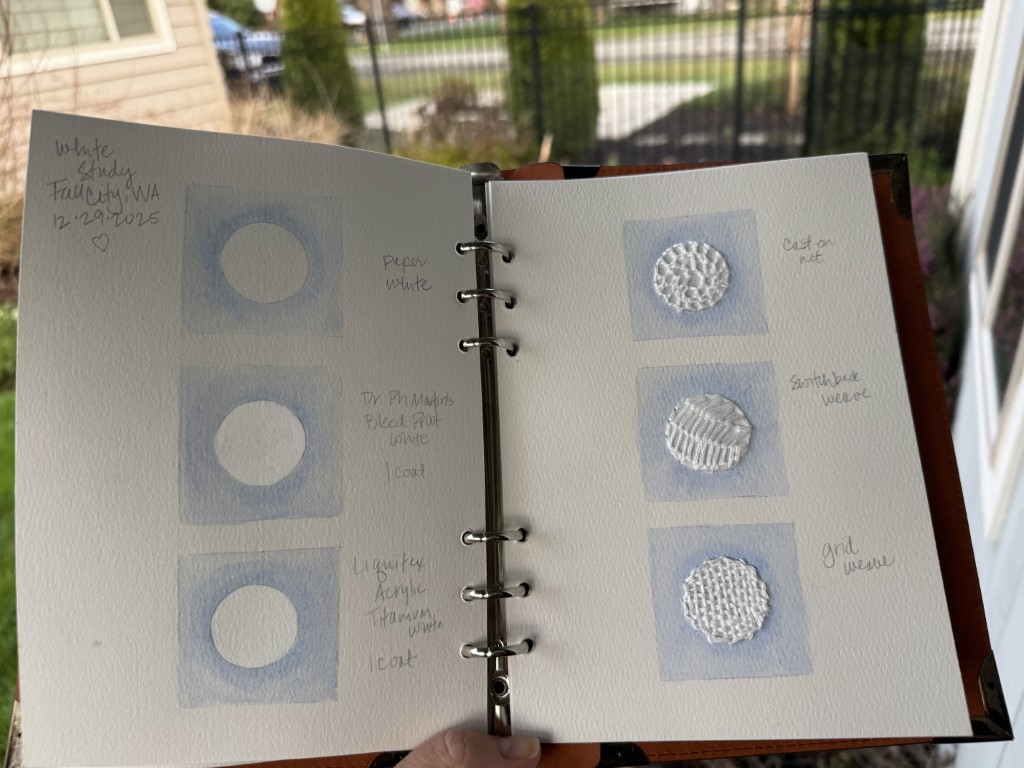
Structure of the study
In this quick study, each sample uses the same underlying structure: a square containing a circle.
The square is consistent across all pieces: 100% cotton, 140 lb cold press paper, lightly washed with ultramarine blue in watercolor (approximately value 3–5). Around the circle, the blue is gathered slightly, allowing the shape to emerge without a hard outline.
The circle is not painted blue. Rather, It remains paper white, and white appears — or doesn’t — through different means.
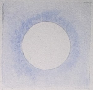
1. White as Paper (No Added Color)
In the first sample, the circle is simply untouched paper. No pigment. No coating. No thread.
Here, white is not applied — it is revealed. Light enters the cotton fibers, scatters, and returns to the eye. The subtle texture of the cold press surface remains fully visible.
This white asks the viewer to participate. The eye completes the circle, and the brain fills in brightness. In this way, the experience is closer to reading than watching — the information is incomplete by design, and perception does the rest.
Nothing replaces the light. Nothing interrupts it.
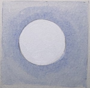
2. White as Paint: Acrylic Titanium White
In the second sample, the circle is painted with acrylic titanium white.
This white sits on top of the paper, sealing it. Light no longer penetrates the fibers; instead, it reflects directly from the surface. The acrylic has a slight sheen and texture, introducing highlights that shift as the viewer moves.
Because of this sheen, the white alternates between brightness and glare, asserting its presence as a surface rather than an opening.
Here, white replaces light — and reflects it selectively.
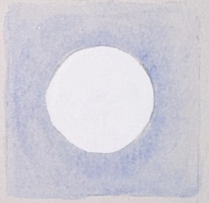
3. White as Paint: Dr. Ph. Martin’s Bleed Proof White
The third sample uses Dr. Ph. Martin’s Bleed Proof White.
Although also opaque, it behaves differently from acrylic. The surface is smoother and flatter, with minimal sheen. It reads less as mass and more as signal.
Placed beside acrylic white, it becomes clear that opacity alone does not define white. Surface finish — matte versus sheen — changes how light is experienced.
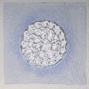
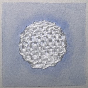
4. White as Structure: Embroidery — Cast-On Net
In the embroidered samples, the blue square is painted first. The circle remains paper white.
White thread is then stitched on top.
In the cast-on net stitch, the thread forms a loose lattice. The paper beneath remains visible. Light passes between stitches, and shadows form where the thread lifts from the surface.
This introduces a new condition: white that casts shadows.
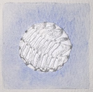
5. White as Structure: Embroidery — Grid Weave
In the grid weave, the stitching is tighter and more regular.
The white thread largely obscures the paper beneath. Shadows are smaller and more controlled, reinforcing a sense of structure and compression.
This white feels built.
6. White as Structure: Embroidery — Switchback Weave
In the switchback weave, the stitch moves back and forth in a looser rhythm.
The paper beneath appears and disappears. The thread rises and falls, producing uneven shadows that shift with viewing angle.
Here, white feels active — less like a surface, more like an event in space.
What this study revealed
Materially, white is not one thing:
- Paper white reveals light
- Acrylic white replaces and reflects light
- Bleed Proof White flattens light into signal
- Thread white reshapes light through shadow
Symbolic or emotional meanings may still arise — but they arise from behavior, not assumption.
White is not neutral. It is a material choice that determines how light is experienced. Which white is right? Ah, that’s artist’s choice, of course!
Closing
I feel like this study helps to explain my ongoing pull toward iridescent and reflective materials (yes, this girl does like her sparkles). When light shifts across a surface, the brain stays engaged — adjusting, comparing, filling in gaps. Like the paper white in this study, these materials ask the viewer to participate. Seeing becomes less about receiving information and more about completing it.
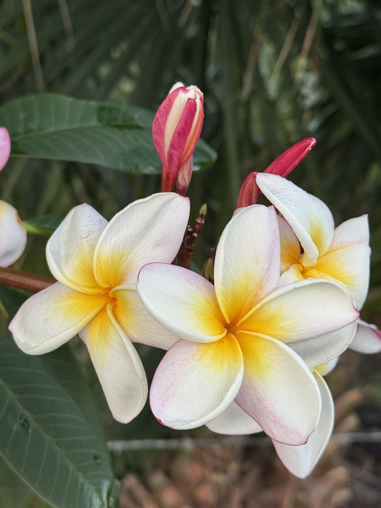
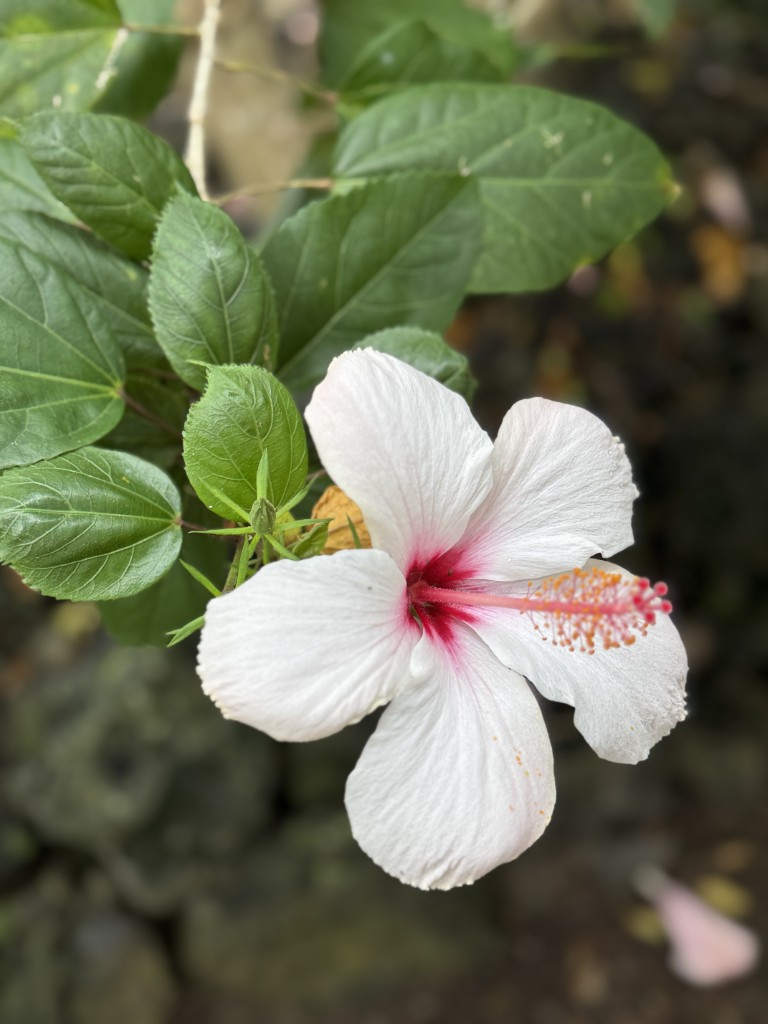
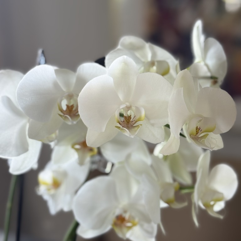
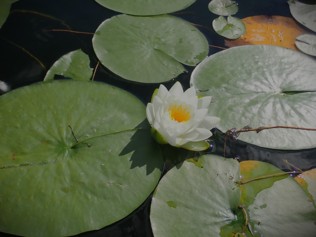
Whew!! Now that we know how to engage with white, let’s be inspired to paint and stitch some beautiful white flowers!
Ah, but that’s a story for another rainy day. xo
#embroidery #embroideryonpaper #slowstitch #watercolor #mixedmedia #whitestudy
